
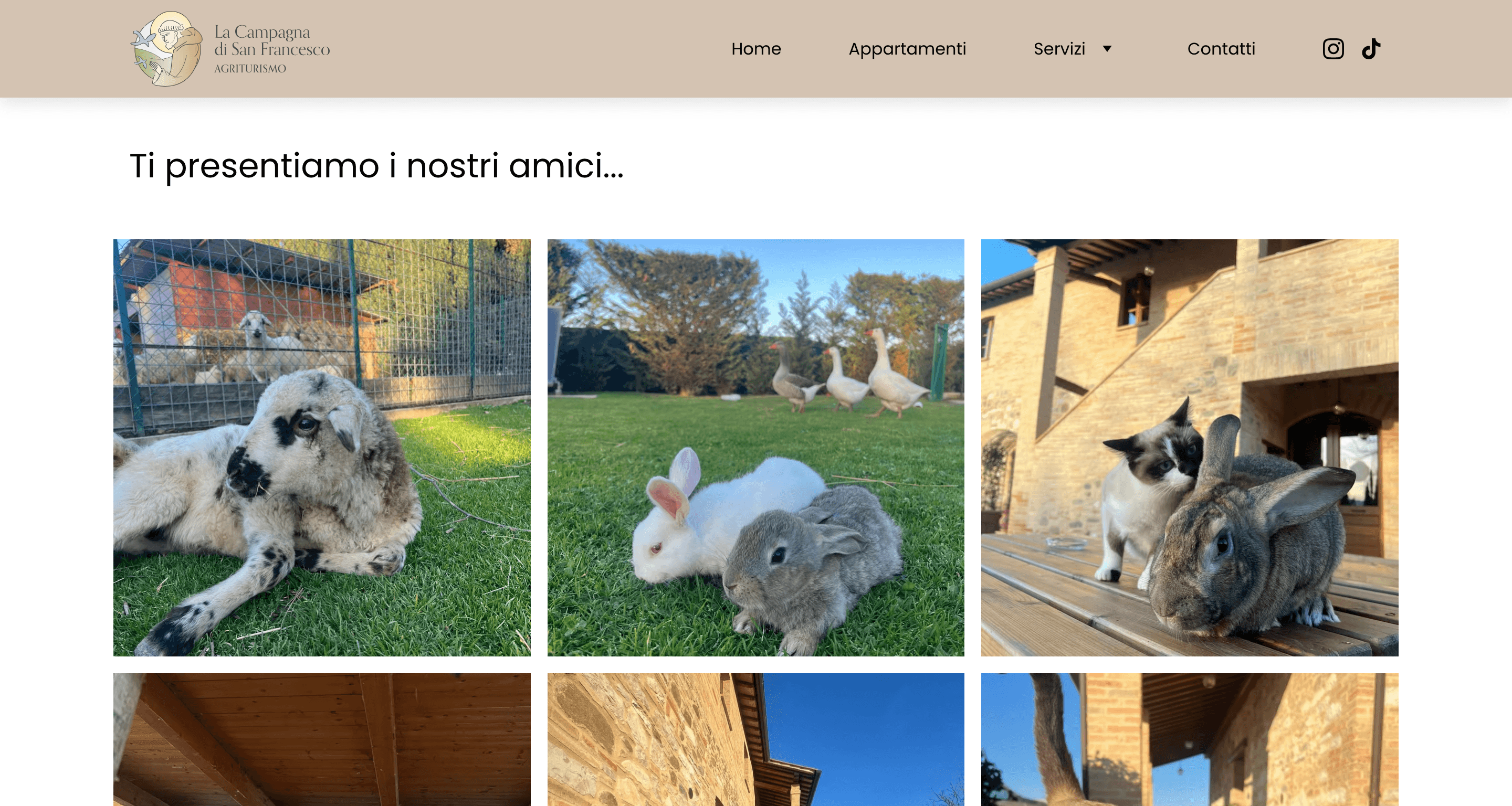
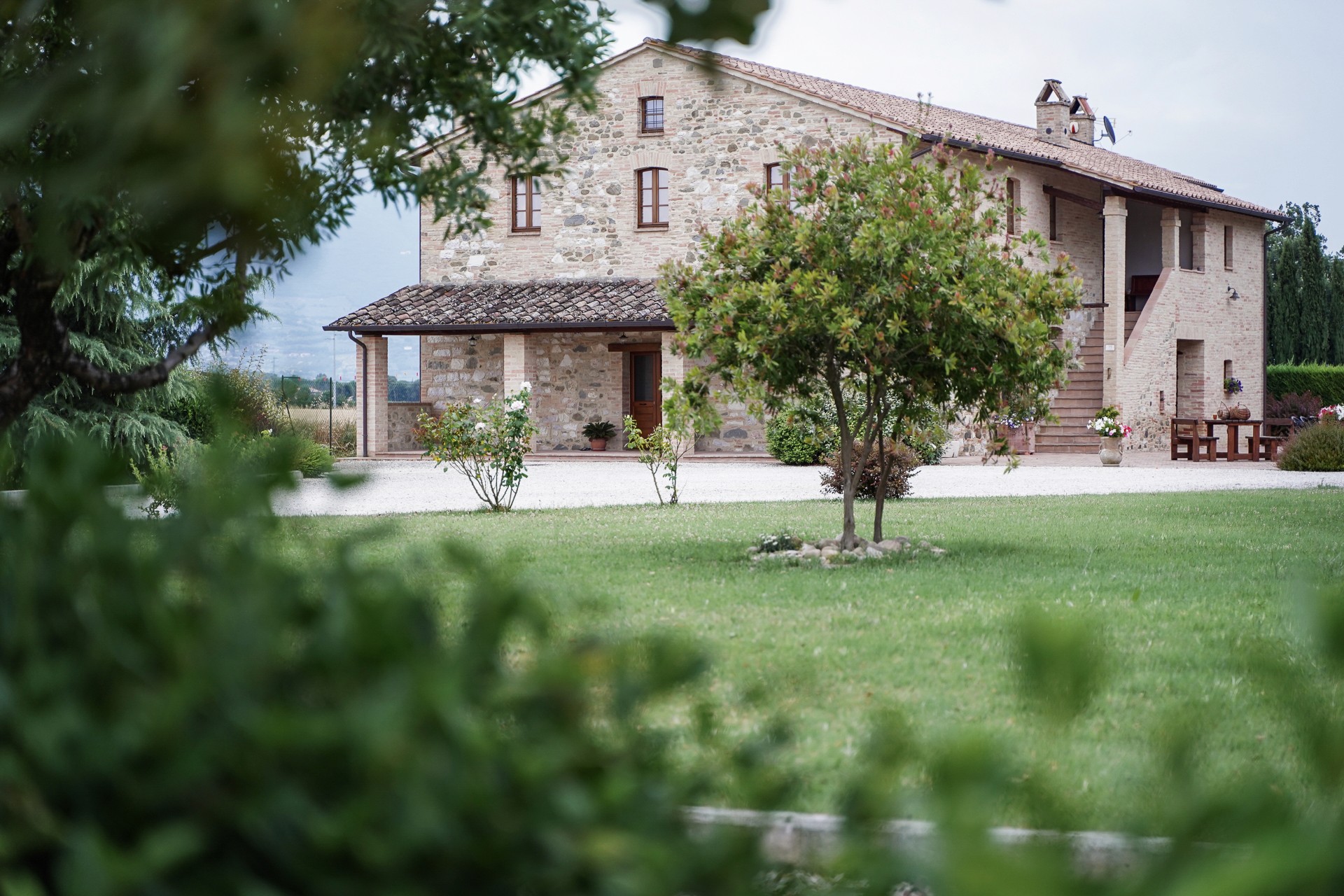
A Cohesive Visual Identity For A Charming Italian Agriturismo.
A Web Tool That Pairs Fonts
With Perfect Chemistry.
A Cohesive Visual Identity For A Charming Italian Agriturismo.
(3)

(4)

(3)

(4)

(4a)

The logo draws inspiration from
Saint Francis Preaching to the Birds, a 13th-century fresco by Giotto, the 15th scene in a series of 28 that narrate the saint's life, housed in nearby Assisi's main Basilica.
La Campagna di San Francesco
Branding
(4b)

Ciao
Ciao
Ciao
(4b)

Ciao
Ciao
Ciao
(4b)
Ciao
Ciao
Ciao
(1)
(2)

(2a)

(1)

(2)

(2a)

Description
Typetandem is a self-initiated project focused on a typographic task that often challenges designers of all backgrounds: pairing typefaces efficiently without forgetting about aesthetics. While dedicated tools exist, little to none seem to offer real-time feedback, educational resources or anything else to support memory retention or active learning. With the Google Fonts library as its MVP, Typetandem targets the segment of designers who want to understand how typographic pairing works and how to apply it with intention. Features like real-time visual insights, introduced through a streamlined filtering system and supported by open-source bibliographic resources, form the project's backbone and represent its most distinctive features.
Introduction
I got the idea while reflecting on how information-dense the study of a subject like typography can get and how all those rules influence visual communication systems ultimately making or breaking a project. I figured that must be why font pairing at times tends to feel tricky. In fact, while less is more tends to be the general consensus among designers—meaning one well-chosen, high-quality typeface is usually enough—there are plenty of situations where a second font is useful, if not necessary. If choosing a single typeface already involves nuance, pairing it with another introduces a whole new layer of complexity. I asked myself: how can I break this down? I started off by collecting data from a small, mixed group of designers, both students and professionals, to see how they approached existing pairing tools.
Research insights
I got the idea while reflecting on how information-dense the study of a subject like typography can get and how all those rules influence visual communication systems ultimately making or breaking a project. I figured that must be why font pairing at times tends to feel tricky. In fact, while less is more tends to be the general consensus among designers—meaning one well-chosen, high-quality typeface is usually enough—there are plenty of situations where a second font is useful, if not necessary. If choosing a single typeface already involves nuance, pairing it with another introduces a whole new layer of complexity. I asked myself: how can I break this down? I started off by collecting data from a small, mixed group of designers, both students and professionals, to see how they approached existing pairing tools.
To summarize
I got the idea while reflecting on how information-dense the study of a subject like typography can get and how all those rules influence visual communication systems ultimately making or breaking a project. I figured that must be why font pairing at times tends to feel tricky. In fact, while less is more tends to be the general consensus among designers—meaning one well-chosen, high-quality typeface is usually enough—there are plenty of situations where a second font is useful, if not necessary. If choosing a single typeface already involves nuance, pairing it with another introduces a whole new layer of complexity. I asked myself: how can I break this down? I started off by collecting data from a small, mixed group of designers, both students and professionals, to see how they approached existing pairing tools.
Kupferschmid's matrix
I got the idea while reflecting on how information-dense the study of a subject like typography can get and how all those rules influence visual communication systems ultimately making or breaking a project. I figured that must be why font pairing at times tends to feel tricky. In fact, while less is more tends to be the general consensus among designers—meaning one well-chosen, high-quality typeface is usually enough—there are plenty of situations where a second font is useful, if not necessary. If choosing a single typeface already involves nuance, pairing it with another introduces a whole new layer of complexity. I asked myself: how can I break this down? I started off by collecting data from a small, mixed group of designers, both students and professionals, to see how they approached existing pairing tools.
Typetandem is a self-initiated project focused on a typographic task that often challenges designers of all backgrounds: pairing typefaces efficiently without forgetting about aesthetics. While dedicated tools exist, little to none seem to offer real-time feedback, educational resources or anything else to support memory retention or active learning. With the Google Fonts library as its MVP, Typetandem targets the segment of designers who want to understand how typographic pairing works and how to apply it with intention. Features like real-time visual insights, introduced through a streamlined filtering system and supported by open-source bibliographic resources, form the project's backbone and represent its most distinctive features.
I got the idea while reflecting on how information-dense the study of a subject like typography can get and how all those rules influence visual communication systems ultimately making or breaking a project. I figured that must be why font pairing at times tends to feel tricky. In fact, while less is more tends to be the general consensus among designers—meaning one well-chosen, high-quality typeface is usually enough—there are plenty of situations where a second font is useful, if not necessary. If choosing a single typeface already involves nuance, pairing it with another introduces a whole new layer of complexity. I asked myself: how can I break this down? I started off by collecting data from a small, mixed group of designers, both students and professionals, to see how they approached existing pairing tools.
I got the idea while reflecting on how information-dense the study of a subject like typography can get and how all those rules influence visual communication systems ultimately making or breaking a project. I figured that must be why font pairing at times tends to feel tricky. In fact, while less is more tends to be the general consensus among designers—meaning one well-chosen, high-quality typeface is usually enough—there are plenty of situations where a second font is useful, if not necessary. If choosing a single typeface already involves nuance, pairing it with another introduces a whole new layer of complexity. I asked myself: how can I break this down? I started off by collecting data from a small, mixed group of designers, both students and professionals, to see how they approached existing pairing tools.
I got the idea while reflecting on how information-dense the study of a subject like typography can get and how all those rules influence visual communication systems ultimately making or breaking a project. I figured that must be why font pairing at times tends to feel tricky. In fact, while less is more tends to be the general consensus among designers—meaning one well-chosen, high-quality typeface is usually enough—there are plenty of situations where a second font is useful, if not necessary. If choosing a single typeface already involves nuance, pairing it with another introduces a whole new layer of complexity. I asked myself: how can I break this down? I started off by collecting data from a small, mixed group of designers, both students and professionals, to see how they approached existing pairing tools.
I got the idea while reflecting on how information-dense the study of a subject like typography can get and how all those rules influence visual communication systems ultimately making or breaking a project. I figured that must be why font pairing at times tends to feel tricky. In fact, while less is more tends to be the general consensus among designers—meaning one well-chosen, high-quality typeface is usually enough—there are plenty of situations where a second font is useful, if not necessary. If choosing a single typeface already involves nuance, pairing it with another introduces a whole new layer of complexity. I asked myself: how can I break this down? I started off by collecting data from a small, mixed group of designers, both students and professionals, to see how they approached existing pairing tools.
Psst—
Let's keep in touch!
© 2025 Andrea Grilli